Graphic Design
Kaleidocare Brochure Design
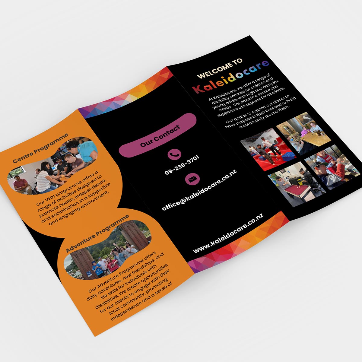
With the opening of Kaleidocare’s new North Shore location, the team was looking to refresh their brochure to reflect their growing services and locations.
The breif
- Showcase all of the different programmes on offer
- Make it easy to see which programmes are available at each location
- Give the overall design a fresh, modern feel
The outcome
- Programme Clarity - We rewrote all programme descriptions to be more informative and engaging. By placing them all on one side of the brochure, we ensured they’re visible at a glance - making comparisons and decisions easier for readers.
- Location Breakdown - To differentiate between locations, we placed the 'Hub' programme on an orange background and introduced a 'Franklin Members Hub' info bubble. This visual separation was further reinforced with a simple, clear table on the back cover showing which programmes are offered where.
- Design Refresh - We modernised the brochure while staying true to the Kaleidocare brand. Their signature rainbow pattern was reimagined through bold, colour blocking gradient backgrounds and more subtle kaleidoscope-inspired accents. We also expanded on the curved photo windows from the original design - using them to feature larger, more impactful imagery that highlights the people, connections, and diverse activities on offer at Kaleidocare.


